10 Python之Matplotlib库
本文共 7636 字,大约阅读时间需要 25 分钟。
Matplotlib中文文档
Matplotlib是一个Python 2D会图库,可以生成各种 硬拷贝格式和跨平台交互式环境的出版物质量数据。Matplotlib可用于Python脚本,Python和IPython shell,Jupyter,Web应用程序服务器和四个图形用户界面工具包
pyplot
matplotlib.pyplot 是命令样式函数的集合,使matplotlib像MATLAB一样工作。每个pyplot函数对图形进行一些更改:例如,创建图形,在图形中创建绘图区域,在绘图区域中绘制一些线条,用标签装饰图形等。
1 二维绘图
1.1 一维数据集
按照给定的x和y值绘图
import matplotlib as mplimport matplotlib.pyplot as plt%matplotlib inline np.random.seed(1000)# 生成20个标准正态分布(伪)随机数, 保存在一个NumPy ndarray中y = np.random.standard_normal(20)x = range(len(y))plt.plot(x, y)
[]

按照给定的一维数组和附加方法绘图
# 按照给定的一维数组和附加方法绘图plt.plot(y)
[]
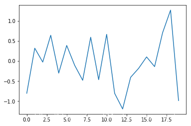
按照给定的一维数组和附加方法绘图
# 按照给定的一维数组和附加方法绘图plt.plot(y.cumsum())
[]

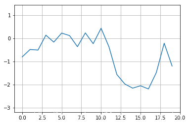
带有网络和紧凑坐标轴的图表
# 带有网络和紧凑坐标轴的图表plt.plot(y.cumsum())plt.grid(True)plt.axis('tight') (-0.9500000000000001, 19.95, -2.322818663749045, 0.5655085808655865)

使用自定义坐标轴限值绘制图表
# 使用自定义坐标轴限值绘制图表plt.plot(y.cumsum())plt.grid(True)plt.xlim(-1, 20)plt.ylim(np.min(y.cumsum()) - 1, np.max(y.cumsum()) + 1)
(-3.1915310617211072, 1.4342209788376488)
带有典型标签的图表
# 带有典型标签的图表plt.figure(figsize=(7, 4))# the figsize parameter defines the size of the figure in (width,height)plt.plot(y.cumsum(),'b',lw=1.5)plt.plot(y.cumsum(),'ro')plt.grid(True)plt.axis('tight')plt.xlabel('index')plt.ylabel('value')plt.title('A Simple Plot') Text(0.5, 1.0, 'A Simple Plot')

1.2 二维数据集
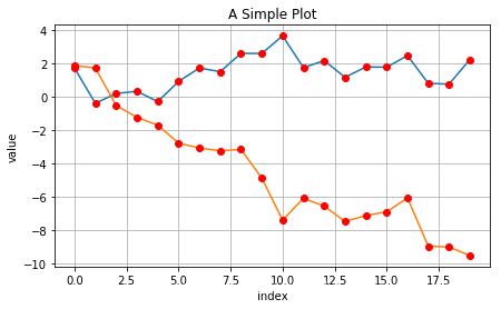
用两个数据集绘制图表
# 用两个数据集绘制图表np.random.seed(2000)y = np.random.standard_normal((20, 2)).cumsum(axis=0)plt.figure(figsize=(7, 4))plt.plot(y, lw=1.5)plt.plot(y, 'ro')plt.grid(True)plt.axis('tight')plt.xlabel('index')plt.ylabel('value')plt.title('A Simple Plot') Text(0.5, 1.0, 'A Simple Plot')
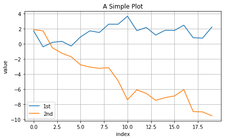
带有数据集的图表
# 带有数据集的图表plt.figure(figsize=(7, 4))plt.plot(y[:, 0], lw=1.5, label='1st')plt.plot(y[:, 1], lw=1.5, label='2nd')plt.grid(True)plt.legend(loc=0)plt.axis('tight')plt.xlabel('index')plt.ylabel('value')plt.title('A Simple Plot') Text(0.5, 1.0, 'A Simple Plot')
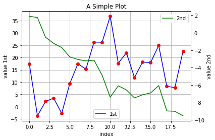
包含两个数据集、 两个y轴的图表
# 包含两个数据集、 两个y轴的图表y[:, 0] = y[:, 0] * 10fig, ax1 = plt.subplots()plt.plot(y[:, 0], 'b', lw=1.5, label='1st')plt.plot(y[:, 0], 'ro')plt.grid(True)plt.legend(loc=8)plt.axis('tight')plt.xlabel('index')plt.ylabel('value 1st')plt.title('A Simple Plot')ax2 = ax1.twinx()plt.plot(y[:, 1], 'g', lw=1.5, label='2nd')plt.legend(loc=0)plt.ylabel('value 2nd') Text(0, 0.5, 'value 2nd')
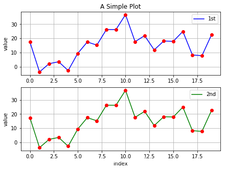
带有两个子图的图表
# 带有两个子图的图表plt.figure(figsize=(7, 5))plt.subplot(211)plt.plot(y[:, 0], 'b', lw=1.5, label='1st')plt.plot(y[:, 0], 'ro')plt.grid(True)plt.legend(loc=0)plt.axis('tight')plt.ylabel('value')plt.title('A Simple Plot')plt.subplot(212)plt.plot(y[:, 0], 'g', lw=1.5, label='2nd')plt.plot(y[:, 0], 'ro')plt.grid(True)plt.legend(loc=0)plt.axis('tight')plt.xlabel('index')plt.ylabel('value') Text(0, 0.5, 'value')
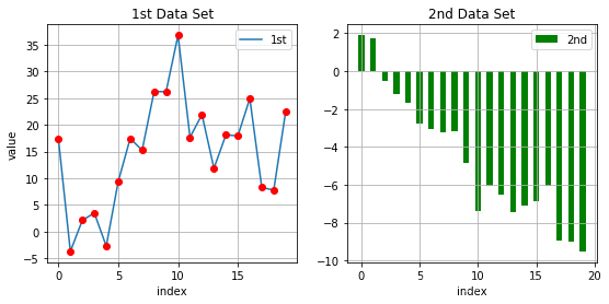
组合线、点子图和柱状子图
# 组合线、点子图和柱状子图plt.figure(figsize=(9, 4))plt.subplot(121)plt.plot(y[:, 0], lw=1.5, label='1st')plt.plot(y[:, 0], 'ro')plt.grid(True)plt.legend(loc=0)plt.axis('tight')plt.xlabel('index')plt.ylabel('value')plt.title('1st Data Set')plt.subplot(122)plt.bar(np.arange(len(y)), y[:, 1], width=0.5, color='g', label='2nd')plt.grid(True)plt.legend(loc=0)plt.axis('tight')plt.xlabel('index')plt.title('2nd Data Set') Text(0.5, 1.0, '2nd Data Set')
1.3 其他绘图的样式
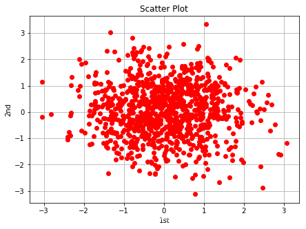
通过plot函数绘制散点图
# 通过plot函数绘制散点图y = np.random.standard_normal((1000, 2))plt.figure(figsize=(7, 5))plt.plot(y[:, 0], y[:, 1], 'ro')plt.grid(True)plt.xlabel('1st')plt.ylabel('2nd')plt.title('Scatter Plot') Text(0.5, 1.0, 'Scatter Plot')
通过scatter函数绘制散点图
# 通过scatter函数绘制散点图plt.figure(figsize=(7, 5))plt.scatter(y[:, 0], y[:, 1], marker='o')plt.grid(True)plt.xlabel('1st')plt.ylabel('2nd')plt.title('Scatter Plot') Text(0.5, 1.0, 'Scatter Plot')

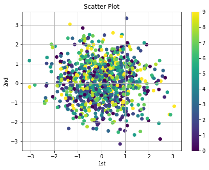
# 具备第三维的散点图c = np.random.randint(0, 10, len(y))plt.figure(figsize=(7, 5))plt.scatter(y[:, 0], y[:, 1], c=c, marker='o')plt.colorbar()plt.grid(True)plt.xlabel('1st')plt.ylabel('2nd')plt.title('Scatter Plot') Text(0.5, 1.0, 'Scatter Plot')
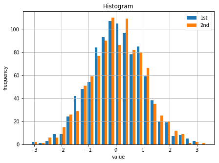
两个数据集的直方图
# 两个数据集的直方图plt.figure(figsize=(7, 5))plt.hist(y, label=['1st', '2nd'], bins=25)plt.grid(True)plt.legend(loc=0)plt.xlabel('value')plt.ylabel('frequency')plt.title('Histogram') Text(0.5, 1.0, 'Histogram')
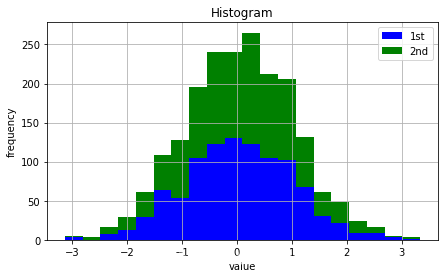
两个数据集堆叠的直方图
# 两个数据集堆叠的直方图plt.figure(figsize=(7, 4))plt.hist(y, label=['1st', '2nd'], color=['b', 'g'], stacked=True, bins=20)plt.grid(True)plt.legend(loc=0)plt.xlabel('value')plt.ylabel('frequency')plt.title('Histogram') Text(0.5, 1.0, 'Histogram')
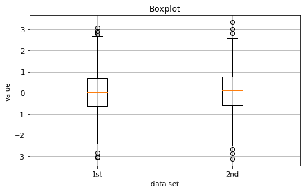
两个数据集的箱形图
# 两个数据集的箱形图fig, ax = plt.subplots(figsize=(7, 4))plt.boxplot(y)plt.grid(True)plt.setp(ax, xticklabels=['1st', '2nd'])plt.xlabel('data set')plt.ylabel('value')plt.title('Boxplot') Text(0.5, 1.0, 'Boxplot')
指数函数、积分面积和LaTeX标签
# 指数函数、积分面积和LaTeX标签from matplotlib.patches import Polygondef func(x): return 0.5 * np.exp(x) + 1a, b = 0.5, 1.5x = np.linspace(0, 2)y = func(x)fig, ax = plt.subplots(figsize=(7, 5))plt.plot(x, y, 'b', linewidth=2)plt.ylim(ymin=0)Ix = np.linspace(a, b)Iy = func(Ix)verts = [(a, 0)] + list(zip(Ix, Iy)) + [(b, 0)]poly = Polygon(verts, facecolor='0.7', edgecolor='0.5')ax.add_patch(poly)plt.text(0.5 * (a + b), 1, r"$\int_a^b f(x)\mathrm{d}x$", horizontalalignment='center', fontsize=20)plt.figtext(0.9, 0.075, '$x$')plt.figtext(0.075, 0.9, '$x$')ax.set_xticks((a, b))ax.set_xticklabels(('$a$', '$b$'))ax.set_yticks([func(a), func(b)])ax.set_yticklabels(('$f(a)$', '$f(b)$'))plt.grid(True) 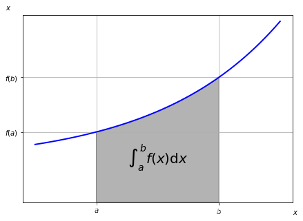
2 金融图表的绘制
matplotlib还提供了少数精选的特殊金融图表,这些图表(如烛状图)主要用于可视化历史股价数据或者类似的金融时间序列数据,可以在matplotlib.finance子库中找到
2.1金融数据的蜡烛图
import mpl_finance as mpf# 这里用tushare获取600118中国卫星的数据import tushare as tsimport datetimefrom matplotlib.pylab import date2numfrom matplotlib.font_manager import FontProperties plt.rcParams['font.sans-serif']=['SimHei'] #用来正常显示中文标签plt.rcParams['axes.unicode_minus']=False #用来正常显示负号start = '2019-03-01'end = '2019-04-01'k_d = ts.get_k_data('600118', start, end, ktype='D')k_d.head()k_d.date = k_d.date.map(lambda x: date2num(datetime.datetime.strptime(x, '%Y-%m-%d')))quotes = k_d.valuesfig, ax = plt.subplots(figsize=(8, 5))fig.subplots_adjust(bottom=0.2)mpf.candlestick_ochl(ax, quotes, width=0.6, colorup='r', colordown='g', alpha=0.8)plt.grid(True)ax.xaxis_date()# dates on the x-axisax.autoscale_view()#plt.setp(plt.gca().get_xticklabels(), rotation=30) 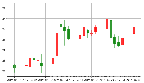
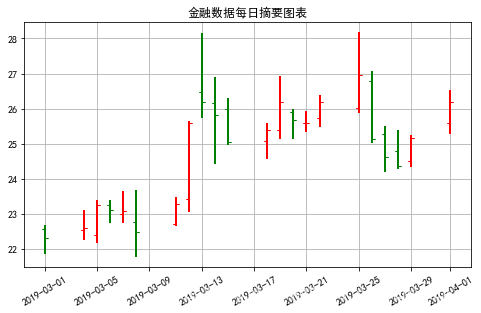
2.2 金融数据每日摘要图表
# 金融数据每日摘要图表fig, ax = plt.subplots(figsize=(8, 5))fig.subplots_adjust(bottom=0.2)mpf._plot_day_summary(ax, quotes, colorup='r', colordown='g')plt.grid(True)ax.xaxis_date()# dates on the x-axisax.autoscale_view()plt.setp(plt.gca().get_xticklabels(), rotation=30)plt.title('金融数据每日摘要图表') Text(0.5, 1.0, '金融数据每日摘要图表')
2.3 蜡烛图和成交量柱状图组合而成的图表
# 蜡烛图和成交量柱状图组合而成的图表fig, (ax1, ax2) = plt.subplots(2, sharex=True, figsize=(8, 6))mpf.candlestick_ochl(ax1, quotes, width=0.6, colorup='r', colordown='g', alpha=0.8)ax1.set_title('中国卫星')ax1.set_ylabel('index level')plt.grid(True)ax1.xaxis_date()plt.bar(quotes[:,0],quotes[:,5],width=0.5)ax2.set_ylabel('volume')ax2.grid(True)#plt.setp(plt.gca().get_xticklabels(), rotation=30) 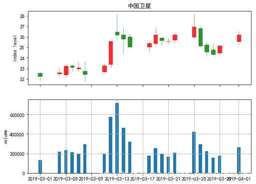
3. 3D绘图
(模拟)隐含波动率的 3D 曲面图
# strike = np.linspace(50, 150, 24)ttm = np.linspace(0.5, 2.5, 24)strike, ttm = np.meshgrid(strike, ttm)iv = (strike - 100) ** 2 / (100 * strike) / ttm# generate fake implied volatilitiesfrom mpl_toolkits.mplot3d import Axes3Dfig = plt.figure(figsize=(9, 6))ax = fig.gca(projection='3d')surf = ax.plot_surface(strike, ttm, iv, rstride=2, cstride=2, cmap=plt.cm.coolwarm, linewidth=0.5, antialiased=True)ax.set_xlabel('strike')ax.set_ylabel('time-to-maturity')ax.set_zlabel('implied volatility')fig.colorbar(surf, shrink=0.5, aspect=5) 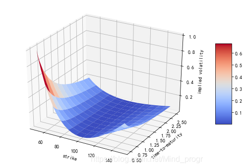
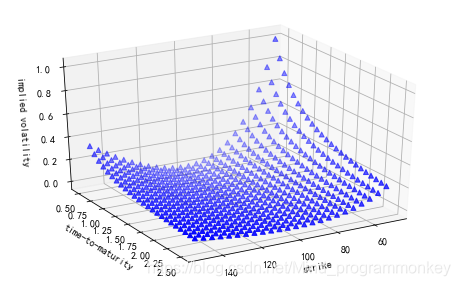
(模拟)隐含波动率的 3D 散点图
#(模拟)隐含波动率的 3D 散点图fig = plt.figure(figsize=(8, 5))ax = fig.add_subplot(111,projection='3d')ax.view_init(30,60)ax.scatter(strike, ttm, iv, zdir='z',s=25,c='b',marker='^')ax.set_xlabel('strike')ax.set_ylabel('time-to-maturity')ax.set_zlabel('implied volatility') Text(0.5, 0, 'implied volatility')
转载地址:http://ndzdf.baihongyu.com/
你可能感兴趣的文章
typescript学习(进阶)
查看>>
三天敲一个前后端分离的员工管理系统
查看>>
EL表达式、JSTL标签库、文件上传和下载
查看>>
Cookie、Session
查看>>
表单重复提交
查看>>
Filter
查看>>
微服务架构实施原理详解
查看>>
必须了解的mysql三大日志-binlog、redo log和undo log
查看>>
Uniform Grid Quadtree kd树 Bounding Volume Hierarchy R树 搜索
查看>>
局部敏感哈希Locality Sensitive Hashing归总
查看>>
图像检索中为什么仍用BOW和LSH
查看>>
图˙谱˙马尔可夫过程˙聚类结构----by林达华
查看>>
深度学习读书笔记之AE(自动编码AutoEncoder)
查看>>
深度学习读书笔记之RBM
查看>>
深度学习word2vec笔记之基础篇
查看>>
法国INRIA Data Sets & Images 数据集和图像库
查看>>
训练自己haar-like特征分类器并识别物体(1)
查看>>
Github系列之二:开源 一行代码实现多形式多动画的推送小红点WZLBadge(iOS)
查看>>
iOS容易造成循环引用的三种场景,就在你我身边!
查看>>
有一个会做饭的女友是一种怎样的体验?
查看>>